Scorecard Visualization
Risk-Kit provides built-in visualization capabilities to help you understand and communicate your scorecard structure.
Installation Requirements
Visualization features require additional dependencies:
pip install risk-kit[viz]
This installs the optional plotly dependency needed for interactive visualizations.
Quick Example
from risk_kit.expert_scorecard.models import ExpertScorecard, NumericFeature, ObjectFeature
from risk_kit.expert_scorecard.models.bucket import NumericBucket, ObjectBucket
from risk_kit.expert_scorecard.visualisation import ScorecardVisualizer
from risk_kit.expert_scorecard.validation import ValidatorRegistry, FeatureWeightValidator

# Create validation registry
registry = ValidatorRegistry()
registry.register(FeatureWeightValidator)

# Create a sample scorecard
scorecard = ExpertScorecard(
    features=[
        NumericFeature(
            name="age",
            family="demographics",
            description="Customer age in years",
            buckets=[
                NumericBucket(definition=(18.0, 25.0), score=-10.0),
                NumericBucket(definition=(25.0, 35.0), score=5.0),
                NumericBucket(definition=(35.0, 50.0), score=15.0),
                NumericBucket(definition=(50.0, 65.0), score=10.0),
                NumericBucket(definition=(65.0, 100.0), score=-5.0),
            ],
            weight=25.0
        ),
        NumericFeature(
            name="annual_income",
            family="income",
            description="Customer annual income",
            buckets=[
                NumericBucket(definition=(0.0, 10000.0), score=-10.0),
                NumericBucket(definition=(10000.0, 20000.0), score=5.0),
                NumericBucket(definition=(20000.0, 50000.0), score=15.0),
                NumericBucket(definition=(50000.0, 100000.0), score=10.0),
                NumericBucket(definition=(100000.0, 1000000.0), score=-5.0),
            ],
            weight=30.0
        ),
        ObjectFeature(
            name="employment_status",
            family="employment",
            description="Customer employment status",
            buckets=[
                ObjectBucket(definition="employed", score=15.0),
                ObjectBucket(definition="self_employed", score=10.0),
                ObjectBucket(definition=["unemployed", "student"], score=-10.0),
                ObjectBucket(definition="retired", score=5.0),
            ],
            weight=20.0
        )
    ],
    validation_registry=registry
)

# Create visualization
visualizer = ScorecardVisualizer(scorecard)
fig = visualizer.create_scorecard_table()
fig.show()
Scorecard Table Visualization
The main visualization feature is the scorecard table, which displays all features, their buckets, scores, and weights in an organized format.
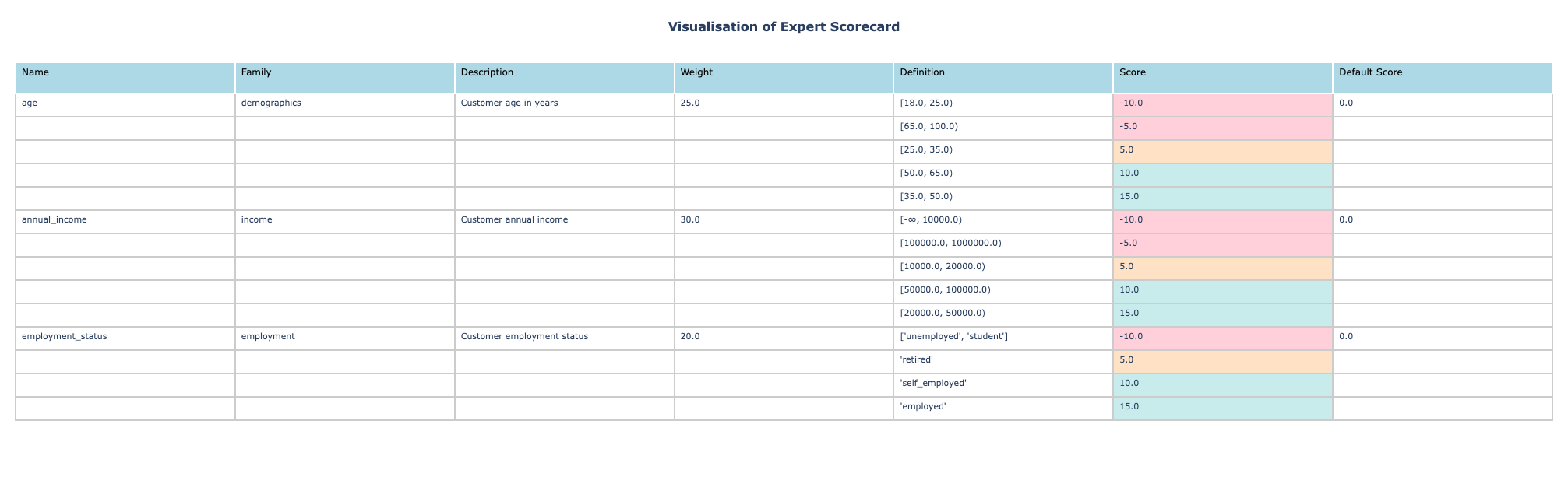
The table includes:
Feature: Feature name and family grouping
Bucket Definition: Value ranges or categories
Score: Points assigned to each bucket
Weight: Feature importance as percentage
Description: Human-readable feature description
Color coding helps identify score ranges:
Low scores: Red-tinted background
Medium scores: Orange-tinted background
High scores: Green-tinted background
Export Options
The visualizer supports multiple export formats:
# Save as HTML file
visualizer.save_html("scorecard.html")

# Get HTML string for embedding
html_string = visualizer.to_html()

# Get Plotly figure for further customization
fig = visualizer.create_scorecard_table()
fig.update_layout(title="Custom Title")
This makes it easy to include scorecard visualizations in reports, documentation, or web applications.